
Step-by-Step Guide: Adding Textual Descriptions to Your Excel Charts

Step-by-Step Guide: Adding Textual Descriptions to Your Excel Charts
Quick Links
Include captions in your Microsoft Excel graphs to provide rich and meaningful labels. The labels can be used to display extra information that is not plotted on the graph. By linking them to cell values, you can make these captions dynamic.
Why Include Captions in Excel Graphs?
When you create a chart in Excel, you are provided with label elements. These include the chart title, data labels, and axis titles. These labels can be very useful for displaying extra information in the chart, especially when you use cell values for Excel chart labels .
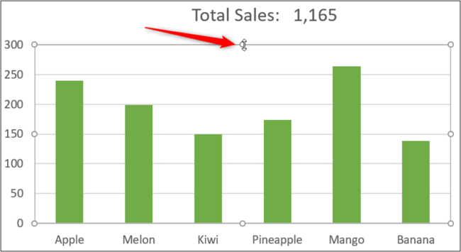
The following chart uses a link to a cell value to show the total cells in the chart title.
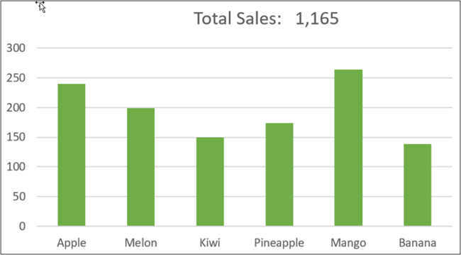
However, you are not limited to these built-in labels. You can include captions in Excel graphs by adding text boxes.
This chart was created using the following set of data.
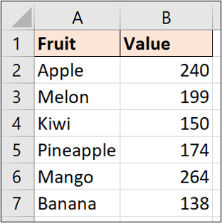
Create the Caption Text
Let’s add a caption to tell more of the story of this data. We will add a caption to convey the top product and its sales total.
First, we need to calculate the data we want to display. In cell D2, the following formula is used to return the maximum sales value.
=MAX(B2:B7)
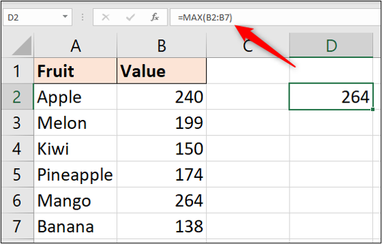
We can then use a formula in cell D3 with the INDEX and MATCH combination to return the name of that product.
=INDEX(A2:A7,MATCH(D2,B2:B7,0))
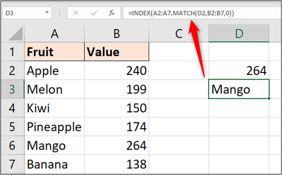
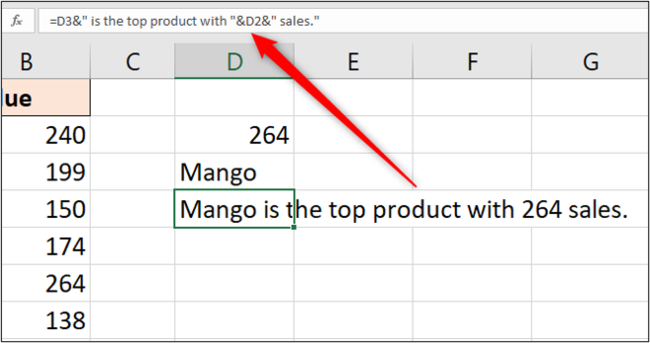
In cell D4, we can make a creative caption from these calculated values.
=D3&” is the top product with “&D2&” sales.”
Add Captions to an Excel Graph
Before we add the caption, we need to resize the plot area of this chart to make some space for it.
Click on the plot area to select it, then drag the resize handle to make room between the chart title and the chart values.
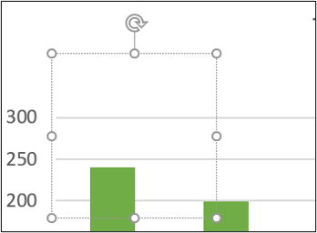
We will include the caption by inserting a text box. Click Insert > Text Box and then select the chart to insert it.
Next, click in the Formula Bar, type “=” and then select cell D4 (the cell containing the caption text).
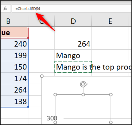
Press the Enter key.
The caption text is shown in the text box and can be moved and resized into an appropriate position on the chart.
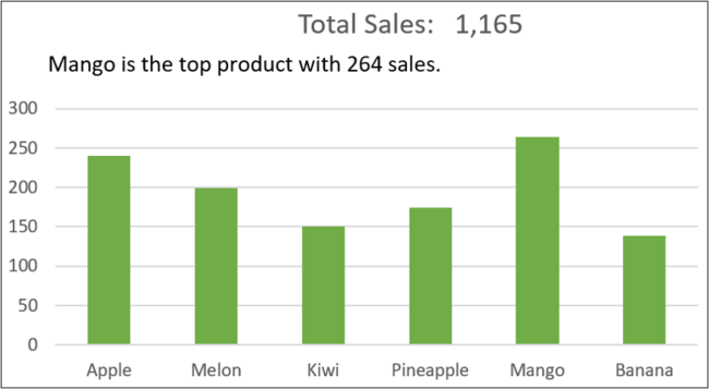
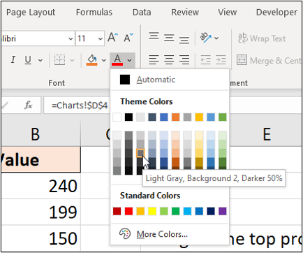
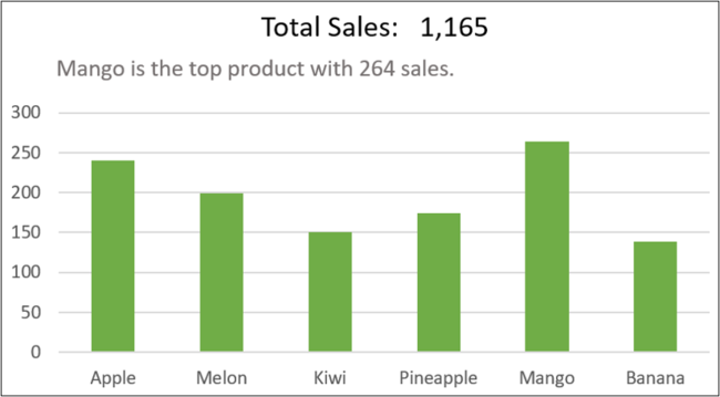
To finish the caption, format it to a light grey so that it is not as impactful as the chart title. Click Home, the list arrow for “Font Color,” then select a light grey.
This is one example of including captions, but it is up to you to be creative. You can show whatever information you want your chart to convey to go beyond the standard charts.
Also read:
- [New] Essential YouTube Tagging Strategies for Optimal Visibility
- [New] Proper Placement of External Webpages in Insta Content for 2024
- 2024 Approved Crafting Cinematic Experiences with Magix Video Pro X
- Discover the Top 5 Audio Editors Empowering VTuber Creators
- Effective Tricks for Fixing DirectX Errors on FIFA 19 Console or PC
- How to Tackle the Stalled Loading at 90% in New Phasmophobia Release - Complete Troubleshooting
- Install Multiple Applications Simultaneously: A Powerful One-Time Uninstaller
- Overcoming Common Problems in Phasmophobia VR Gameplay
- Step-by-Step Guide: Correcting 'PalWorld' Search Function Glitches
- TomTom Bandit Action Camera Review
- Top Gaming Bargains During the 2024 October Prime Shopping Event – Spotted on ZDNet
- Troubleshooting and Resolving Rainbow Six Siege Delays & Freezes
- Troubleshooting Complete: Ending Your Battle with Fortnite Slow Performance
- Title: Step-by-Step Guide: Adding Textual Descriptions to Your Excel Charts
- Author: Mark
- Created at : 2024-11-14 16:12:59
- Updated at : 2024-11-15 16:14:50
- Link: https://win-solutions.techidaily.com/step-by-step-guide-adding-textual-descriptions-to-your-excel-charts/
- License: This work is licensed under CC BY-NC-SA 4.0.